Security By design
Designtitle: Security By design created_at: 2018-07-24T14:52:16.823Z updated_at: 2018-07-24T14:52:16.823Z tldr: security by local fonts is_published: 1 star: true category: Design share_type: share
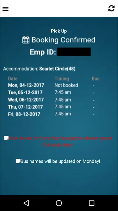
When I was in Kerala, still completing my training, our company gave us accommodation and also bus transportation. In order to make thing’s easy, they had a system to book seats for a week at once and each day we had to show the bus-man booking confirmation, we got in our app, here what it looked like.

App interface for booking a seat
Well, it served its purpose, but it had problems with people. We had a lot of trainees at our building, not to be specific but around 2500 at a time, our offices started at around 8:30 am if I missed the bus, we had to take local transportation. And most of the time at booking the server could not take the load and go crazy (super crazy to cancel all the bookings) and we would lose our booking. So, frustrated people including me would edit the image out to match ours and trespass, I know its bad but it’s not our fault.
Sometime after they knew what’s going on and every day they had approximately 100 sheets of paper wasted to prevent us from doing this.
So, as a designers, I thought of fixing the issue by design.

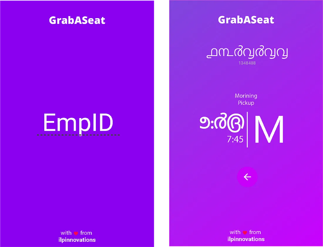
Redesigned interface with native font
・ilp innovations
This design also fixed some of the issues it had with older one. Here’s a list of those and also it’s fixed.
The app was super redundant, for any other user to have their info they had to search for logout and then log in again, and for the people who had no smartphones (like me) basically were out of the party. The new design doesn’t keep a login record, instead, the user need’s to put in his employee id and the app would show whatever the current state of the booking is. This also acted as a validation if the bus-man had a doubt he could ask for logging in.
As this was in Kerala, most of the important aspects of the app were converted to their native language, this is an example to positive use of regional constraint. And most of the associates didn’t know their native language, editing or cheating was kinda no-no.
For each Specific day and each specific person a jumbled up color scheme was presented so there was no cropping and pasting of the UI.
Interfaces can be exploited. Users are always smarter.
Like it ?
Share with friends